
Understand the user’s environment
If you are in the same situation as me, one of the things I suggest you focus on is making sure you understand that AR/MR exists outside of our device. So your design work should exist outside of the device as well, so put away your 2D UI ideas, it’s not easy but once you get the concept you kind of feel free to create amazing things.
So we have to focus on creating a sketch of the actual environment the user will be in. You should be sketching living rooms, tables, and outdoor spaces.
Then as you sketch the user environment, you start with the various objects that are going to interact within that environment. You can sort of think of AR / MR as having a lot of the same challenges as responsive design for the web in terms of different window sizes, but it’s even more complicated because now you have a responsive design for 3d spaces that are the user’s actual living room.
So you want to sketch the user for scale, to get a sense of how you are going to start crafting this experience. The user could be very large relative to the AR objects or very small and then you wanna think how that user is going to move around in that environment.

Plan for the user’s environment
So now that we understand how to design for the environment let’s think about how to design for user movement. It’s important to set user expectations ahead of time about the physical scale of the experience. Let’s dive into the three of them.
IMPORTANT TIP:
It’s ok to design beyond the bounds of the screen.
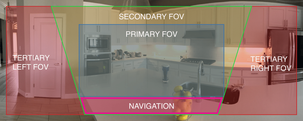
Users are more familiar with 2D mobile applications that do not require the user to move as a form of interaction, it can be very challenging getting users to realize that they can move around. So this is one important point, to create movement UI elements at the beginning to help users understand that they can move around those objects. When an object moves outside the screen they are replaced with a marker that indicates there is an object in that place. I found this concept diagram which I thought was pretty interesting and the most accurate. We do have a PRIMARY FOV but we also can move our user around to other views. It helps to have this in mind when designing.
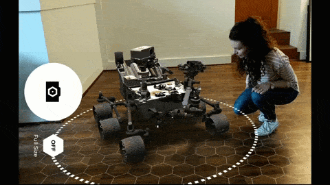
Another important thing to consider when designing your APP is determining how much space the user needs. Right now designers indicate that experiences fall into three different sizes.
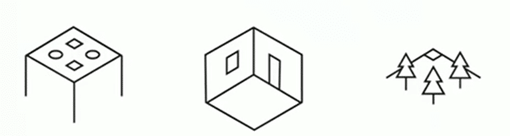
Table ScaleRoom ScaleWorld ScaleIn this case, the experience can scale to the smallest of surfaces so that many users can interact/enjoy the experience.In this case, it expands the impact of AR, so that content will start to feel life-sized and you can do a lot more with the available space.In this case, there are no limits, allowing users to appreciate AR in whatever area they see fit. This is an area particularly exciting because of procedurally generated content on a world scale.
So, to sum up, this part, how much you require users to move around the space will depend on the type of app you are creating.
Onboard users by initializing smoothly
Another thing you want to think about is deciding if users can easily move the objects after they’ve been placed, or if they are more permanent objects. The answer of course will depend on the app you are developing (Augmented Reality or Mixed Reality).
For permanent objects, we have to consider using anchors for these persistent object placements. You may still wanna enable the user to move the object perhaps through a menu or some type of re-anchoring flow. So set expectations ahead of time whether the objects will be sort of stuck in one place for a while as you interact with the object.
Design natural object interactions
One other thing we have to consider is thinking about how to solve problems with user behavior, even when it’s unintentional. So one of the recommendations is giving users feedback on object collisions.
This is a problem that I faced while trying to build prototypes, when I was getting too close to an object it disappeared. Why did this happen? If I got close it meant I was inside the object, in this case, it’s recommended that you change the user view with a sort of effect, to let the user understand that they’re inside the object.
It is also important to give feedback to the user, this will be helpful when we think of each stage of the user journey, even as it relates to surface feedback. Think about how an object might get on the scene.
Balancing on-screen and volumetric interface design
The last thing you want to remember is that the device is the user viewport. They are using the device to look out into the scene and see the application. So you don’t want to place a lot of the 2d UI on the screen that’s going to obscure the user’s view into your application.
Only use screen surface UI for
- Controls with high-frequency use
- Controls that require fast access
Hope this helps you to start thinking outside the box when designing your next app.